Shaking up a protein brand for its next era of growth.
Purpose Consultancy
REQUIREMENT
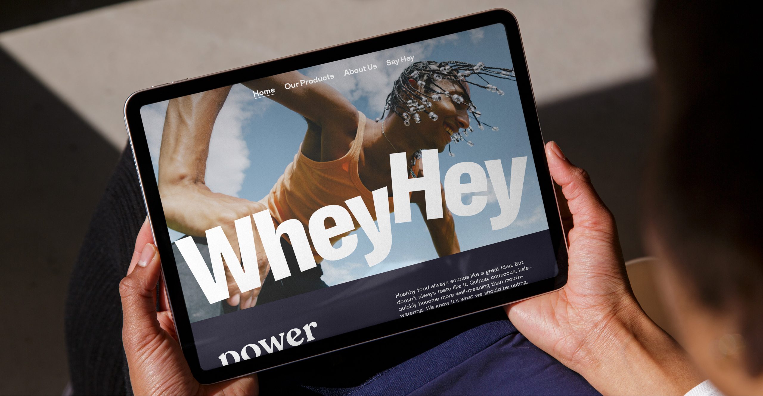
WheyHey disrupted the early protein market with its radical no-sugar, high-protein ice creams. But as the brand prepared to expand across new product categories, growth had begun to plateau. To unlock its next phase, WheyHey needed a brand that could translate protein beyond performance – connecting wellbeing with enjoyment, and bringing its ‘Live Outrageously Well’ mindset to a broader audience through a new purpose “Wellbeing not well-boring”.
A flexible system
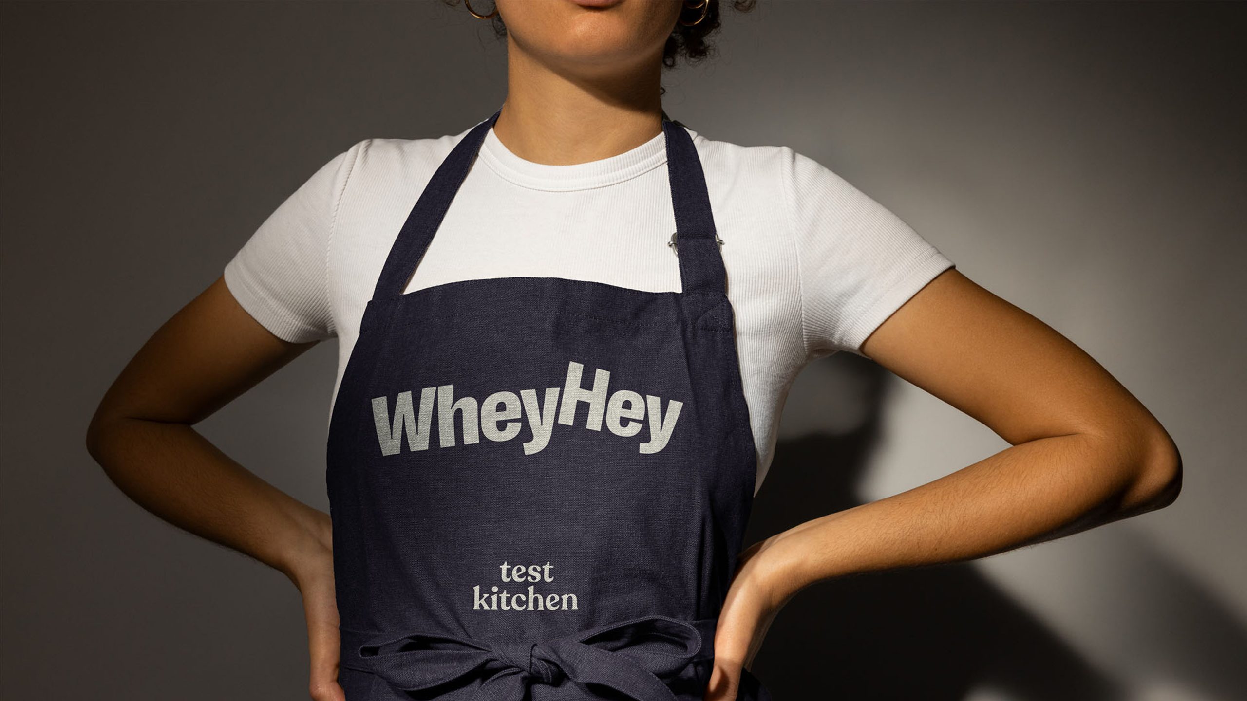
We created a new brand system, to reflect the brand’s evolved purpose. At its heart sits a playful ‘naughty and nice’ idea – capturing the unique combination of both indulgence and nutrition that WheyHey delivers on.
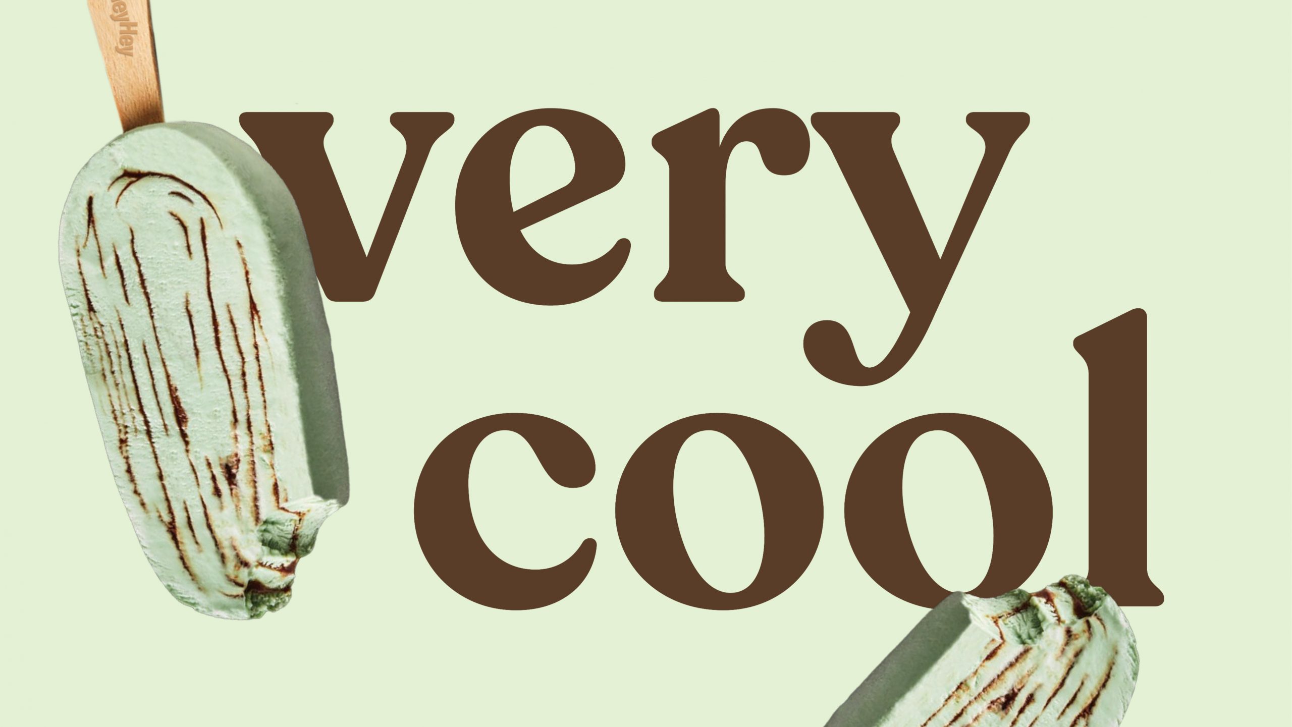
A vibrant colour palette flexes to show the breadth of flavour using pairs to create variation.
TYPOGRAPHY
Two distinct typefaces reflect the duality of ‘naughty and nice’: one celebrating flavour and pleasure, the other delivering clear, accessible nutritional guidance. Small details deliver friendliness and joy with curving humanist forms and large open counters.
PACKAGING SYSTEM
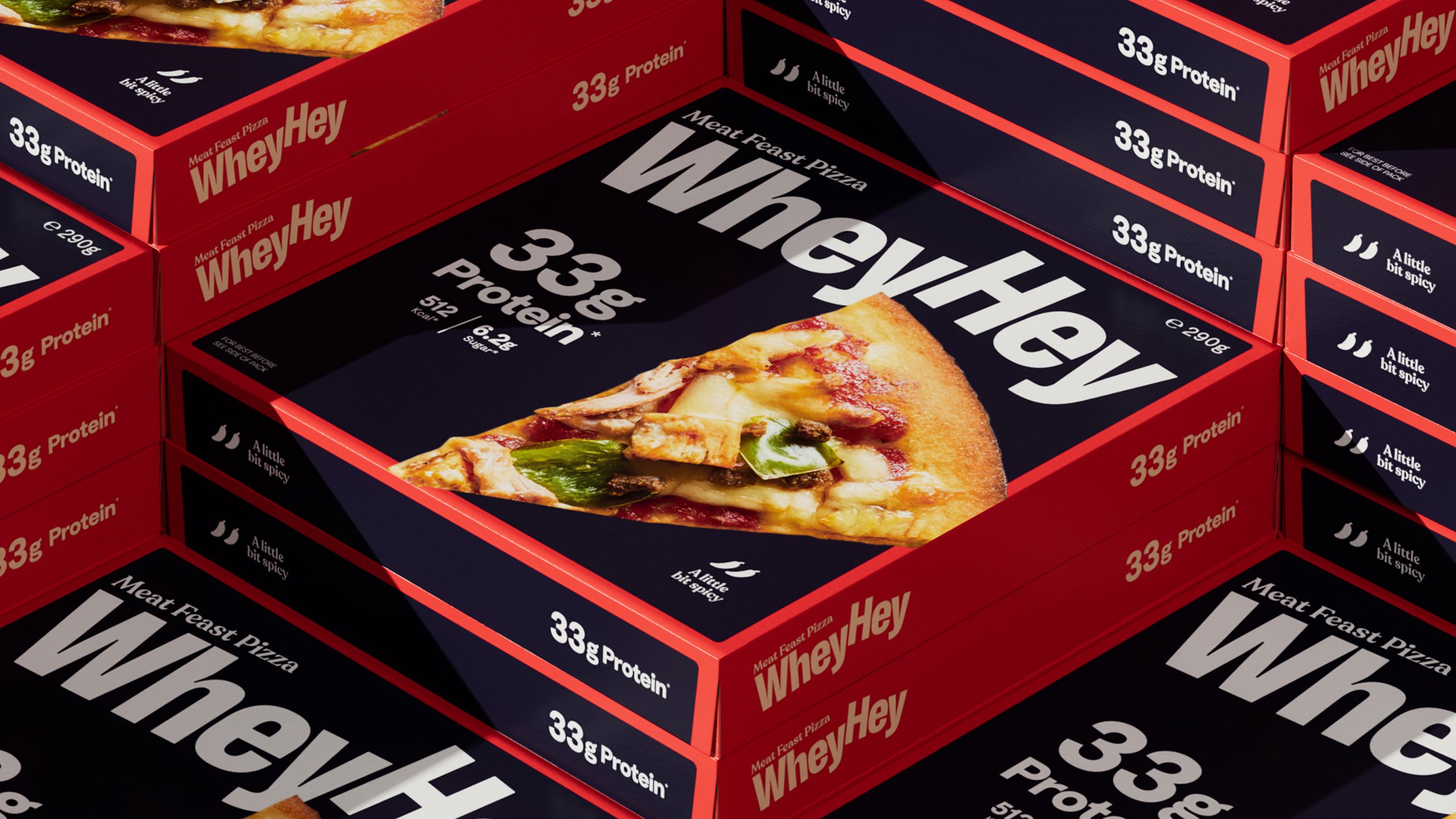
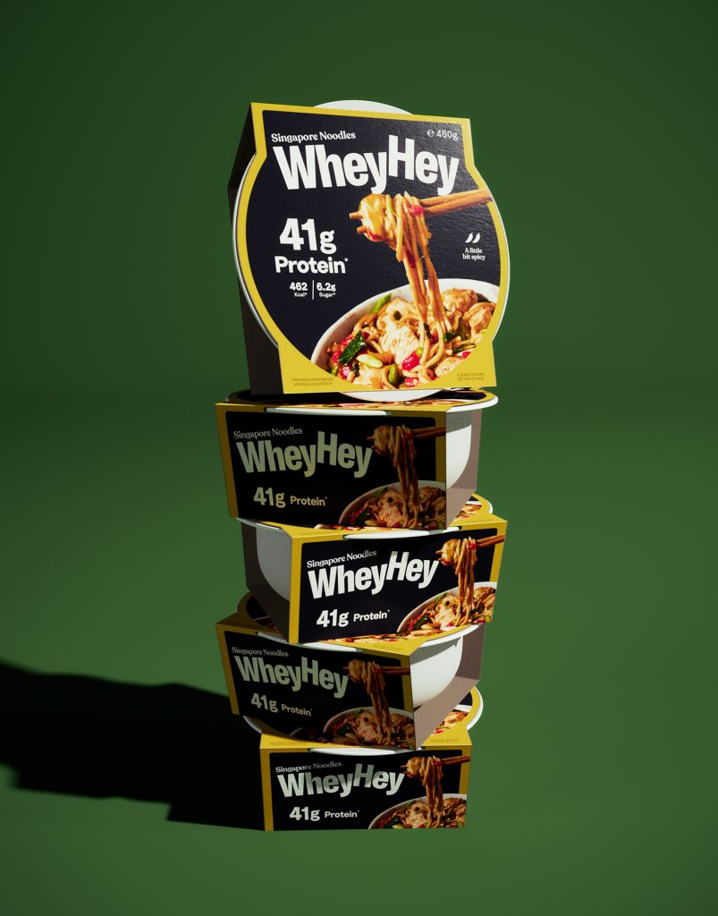
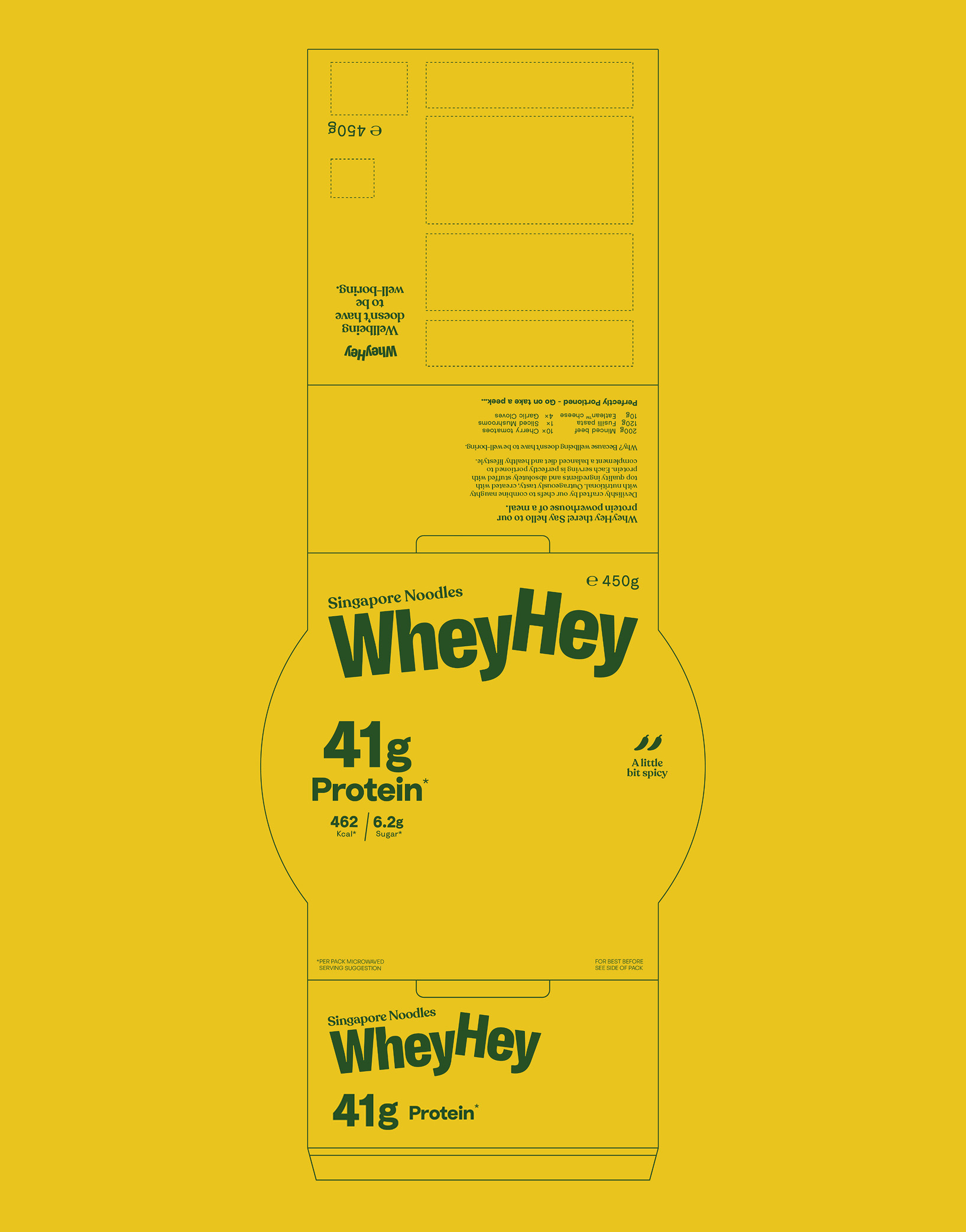
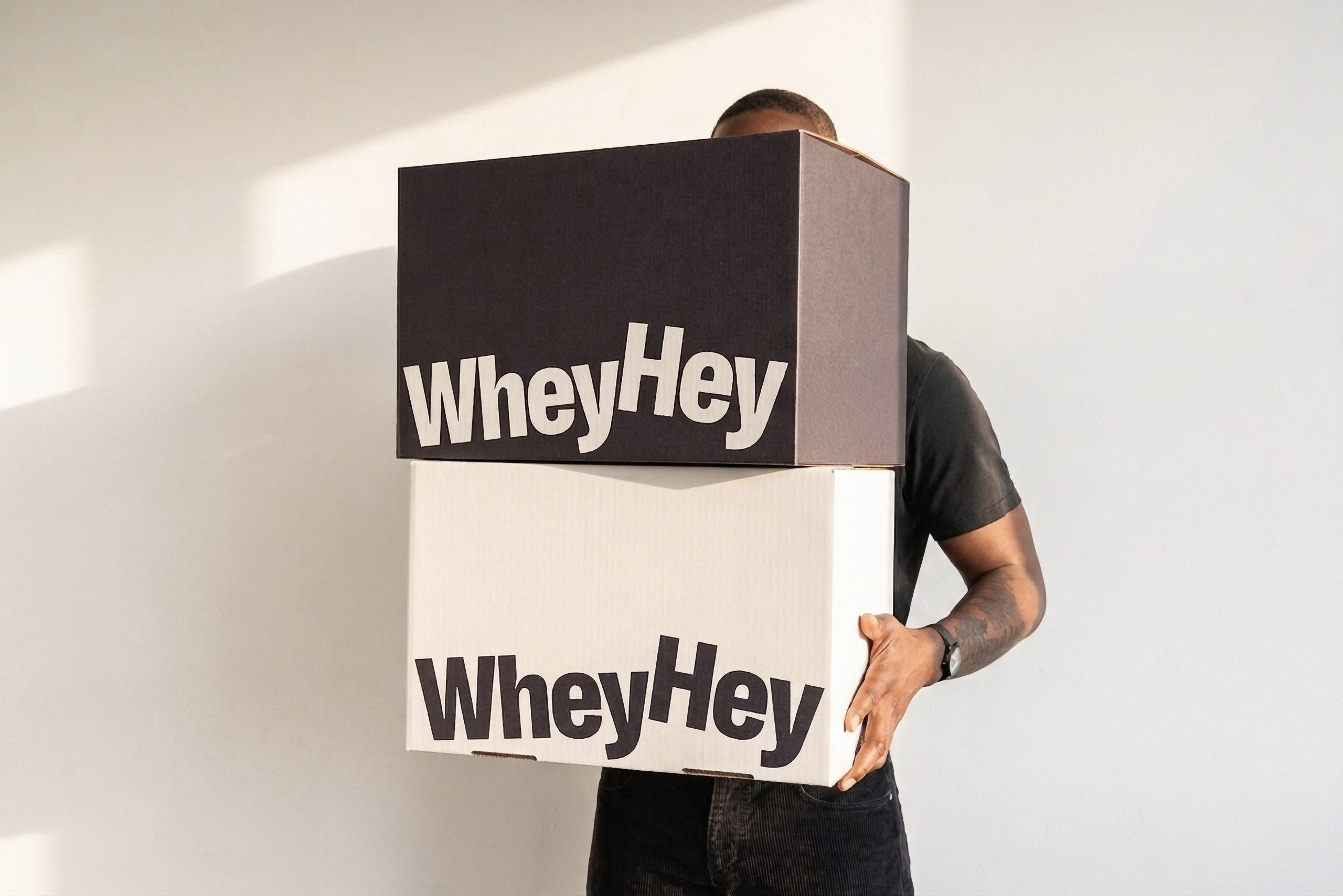
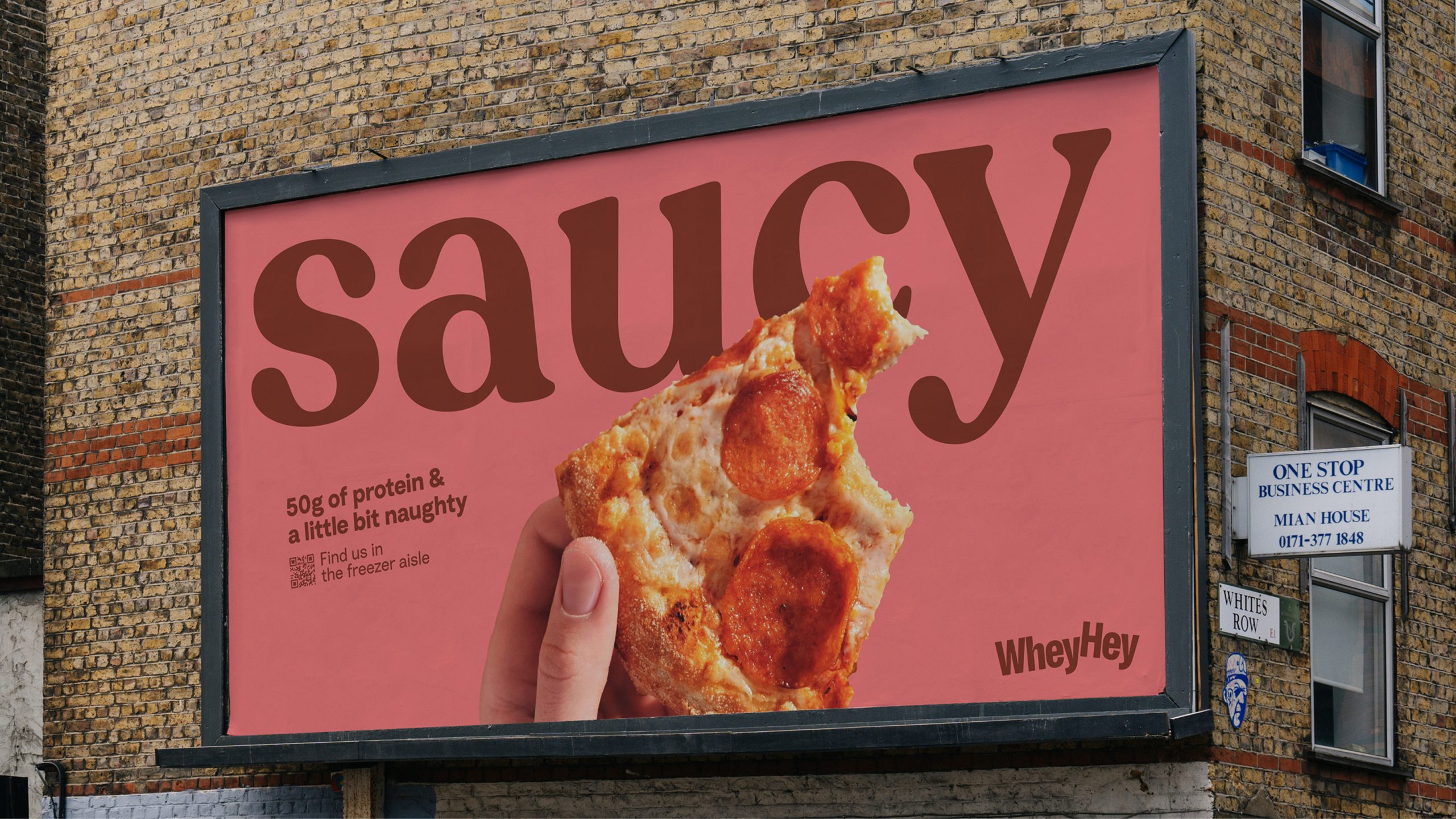
Underpinned by a modular packaging system, the identity flexes confidently across ice cream, chilled desserts, ready meals and on-the-go snacks – enabling WheyHey to grow beyond the health food aisle and into everyday life.
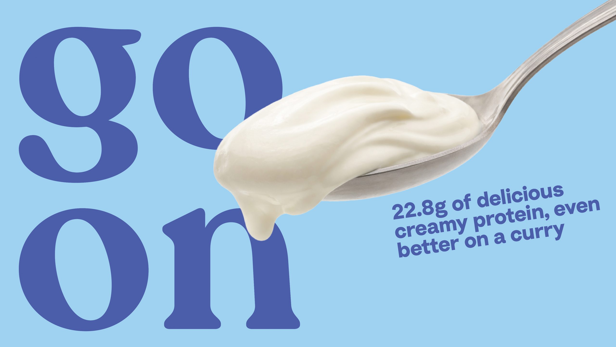
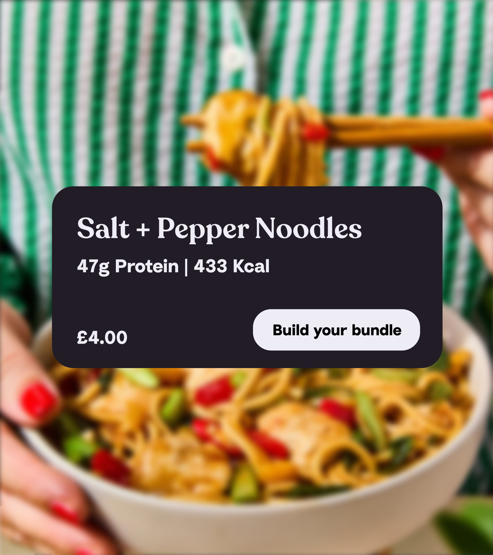
This was brought to life through bold, inviting food photography, and a cheeky tone of voice that reframed WheyHey from functional protein brand to lifestyle food brand – in other words, wellbeing without the wellboring.
Related work
Ovarian Cancer Action
Giving ovarian cancer the focus it needs for every woman to be a survivor.
By clicking 'Accept All Cookies', you agree to the storing of cookies on your device to enhance site navigation, analyse site usage, and assist in our marketing efforts.